Publishing Update: A new cover coming
Posted June 29, 2007 by Terry Fallis
Well, even though I really love what Steve Palmer at 76design developed for the cover, it seems I may not be the best judge of such things. The official iUniverse review of my submitted cover is in and it looks like we’re heading back to the drawing board, literally. The design experts at iUniverse made a few interesting observations including:
– the design I submitted was a little “flat;”
– the typography needed some work;
– the juxtaposition of the word “Plans” in the title and the line drawing of the hovercraft plans was too “literal;”
– the overall look and feel didn’t really convey that this is a satirical novel.
Interesting points and not without merit I suppose when their reasoning was clarified for me. So, their design team is going to take a stab at designing a cover that still uses the Parliament Hill photograph in some way. The line drawing of the hovercraft plans may move to the back cover.
I asked that they do their best to preserve the Allan Rock quotation on the front cover, as I think it really helps to add credibility and legitimacy to this self-published novel. As well, while this is a satirical novel, there are serious themes that underlie the fun. Satire yes, slapstick no.
So now we wait for a couple of weeks. I’ll post the result when I receive it.


How much say do you have in the iUniverse process? Could you have kept your original cover? Do their changes have anything to do with their Eiditor’s and Publisher’s Choice designations? I wish you luck with the final product…
Ter,
I like the cover design as it is, and don’t agree with those comments, except maybe the last one.
As you said, it’s difficult to visually convey the sense that it is a satirical novel without undermining the serious side to the book.
Perhaps I’m being overly literal, but have you considered adding in the strapline “A satirical novel of Canadian politics” under the title?
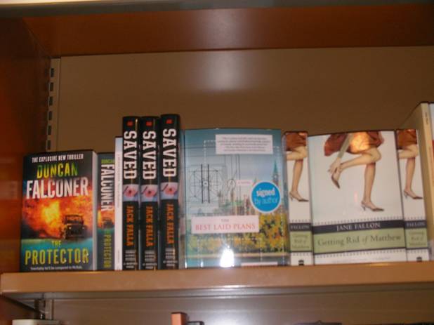
Hi Backbayzona. Thanks for checking in. I’m not completely clear on this yet but as I understand it, to receive the coveted Publisher’s Choice designation, which means the novel will actually be on sale at a local Indigo store (Canadian equivalent of Barnes and Noble), the cover has to be approved. I’m not sure whether the Publisher’s Choice panel would agree to go with my cover but I will probably ask the question, unless I love what the designers come up with. In the end, I can reject what they propose and publish with my cover (which I still really like) but I may not get the Publisher’s Choice designation in that case. I’ll definitely keep you posted.
Hey Jon, good to hear from you. I have thought about a more descriptive strap line but I think it would definitely be out of the ordinary in the publishing world. We’ll see what the designers do with the cover. The plan is to stick with photograph but perhaps crop it differently, angle it differently, or even tint it differently. I’m curious to see what they do to convey the satirical aspect of the novel. Anyway, ultimately, it’s my decision, not theirs, but it would be nice to have the Publisher’s Choice designation. I appreciate your thoughts on the matter. I too really like the design I submitted…
Ter,
You can count me as another vote in loving the cover as you have it designed now. I actually liked the play on “Plans” with the hovercraft plan there, because without reading the book you won’t actually have a clue what the plan is of. I can understand the point about people not knowing it is a satirical novel… but there definitely is a serious side. Perhaps instead of “A Novel”, you could say “A Satire”? Another point for the current design is that it matches what has been used for the podcast, website, etc…. although obviously that all could be changed later to match a new design if you felt so inclined. Anyway, it will be curious to see what iUniverse comes up with!
Dan
Thanks Dan. I too still really like the original design. Having said that, I’m very curious to see what the iUniverse designers come up with. I’m trying to keep an open mind and I really do want that “Publisher’s Choice” designation which would actually put the novel out on a front display table in at least one Indigo outlet, Canada’s version of Barnes and Noble (which I know you know, as a Canadian in training…). Talk to you soon…