New Cover for TBLP
Posted July 23, 2007 by Terry Fallis
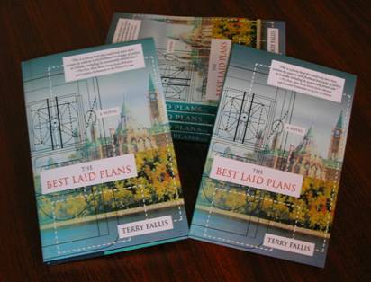
 Well, after much debate and some last minute tweaking, here’s the new cover of TBLP. It’s quite a bit different from the version I submitted but if you look closely, all of the original elements are still there. The photo is the same, although it’s been treated and turned into what looks more like a painting than a photo. The line drawing of the hovercraft is the same and the typeface is also the same. Finally, the Allan Rock quotation stays on the front. While much has stayed the same, it does look quite a bit different.
The designer had a change of heart and decided to keep the hovercraft plans front and centre. I confess that I wasn’t too keen on the new design when I first saw the designer’s first crack at it a week or so ago. However, this second iteration is much better and is quickly growing on me.
Next step, layout of the book and proofreading. If all goes well, I’ll be holding the printed book in my hands in about 10 weeks. (Shortly after that, I hope you’ll be holding in your hands!)
I imagine this new cover will take some getting used to, particularly if you liked the original as much as I did. But I’m getting there…


Ter,
As a loyal reader, I have to say I think that the new cover design is simply awful. I much prefer the 76design version.
Hi Jon,
I figured you might feel that way about it. Give it some time and see if it grows on you. I’m surprised how much better I feel about it now that I’ve been living with it for a week or so. I still love the original design…
Hey Ter…I agree with Jon.
I just showed it to Jill, however, and she likes the new one better! “It’s more modern,” was her assessment.
Hi Joel,
Glad that Jill is on side. It’s going to take some getting used to. I like it much more now that I did at the start. I’ve always loved the original version and still don’t fully grasp why the Publisher’s Choice panel thought a new cover was warranted. Anyway, I’m sacrificing so that the book will be displayed in our version of Barnes and Noble. Who knows whether it’s the right call. Your book must be close now isn’t it?
Ter,
To my eyes, the new cover design is just a bit all over the place, but I guess it is more modern, and may be engaging because of that. If the decision is already made, then I’ll leave you in peace!
I agree that it looks more muddled than the very clean original version. I’m hoping the designers of the new cover know more about this stuff than I do. I guess we all know what we like. Take care…