TBLP designer Scott Richardson interviewed
Posted March 9, 2009 by Terry Fallis
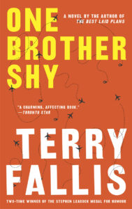
In my daily travels online I stumbled upon a very interesting three part video vignette on book design by Scott Richardson. He’s the awarding novelist and designer who is responsible for the way the eye-catching McClelland & Stewart edition of TBLP looks, inside and out. (In case you’re wondering, Random House owns a chunk of M&S and that’s why Scott designed TBLP.) I learned more about book design by watching these three clips than I’ve ever known about this complex and creative field. Admittedly, I was not very far up the learning curve to begin with!
In the first clip, Scott Richardson discusses the evolution of book design from 1100s to the present. Fascinating.
In the second clip, Scott talks about the interior design of the book including typeface and the all-important “grid” that dictates how the pages are used.
Finally, in the third clip, Scott explores the myths and considerations the govern cover design.
If you’re passionate about books, I can’t imagine watching these video clips and not finding it all illuminating and interesting. I’ll now be looking at books through a slightly more informed set of eyes. Thank you Scott for your wonderful design for TBLP and for your insights on creating a memorable look for books.
